The Main Idea
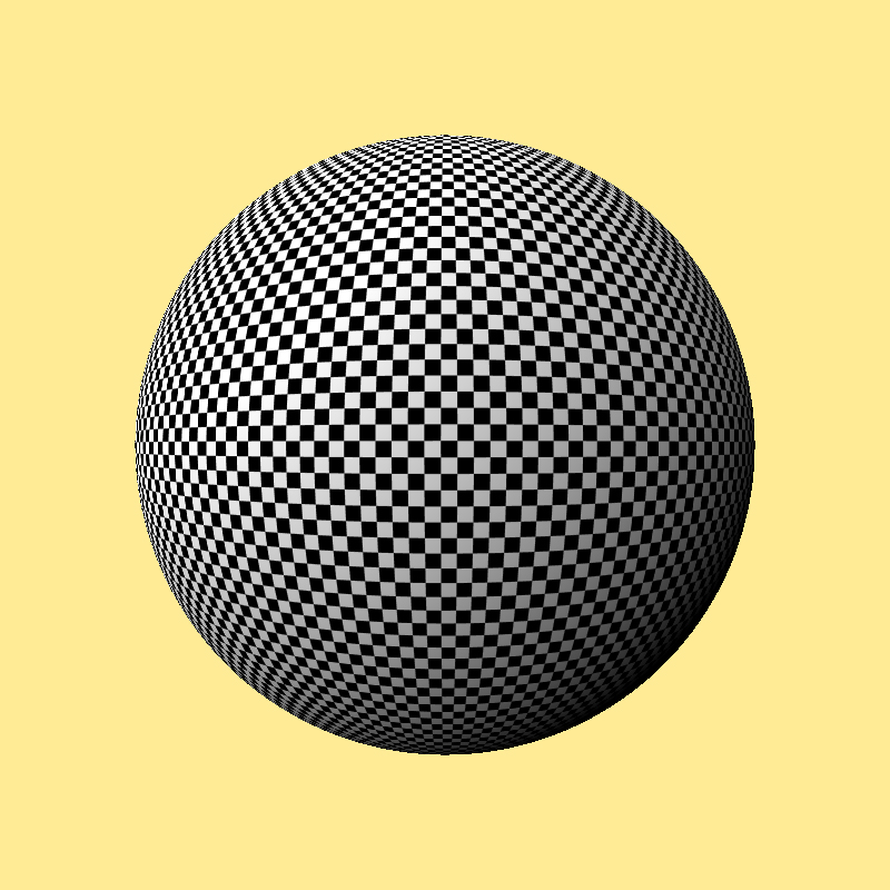 When we create an image with ray tracing, every ray is expensive and precious. We should squeeze out all the information we can from every ray. This project was intended to help us do just that, and make better pictures, faster. I like this little idea quite a bit, but the reference is just about impossible to find (I don’t even have copies of the paper or the files any more!). So here I’ll describe the essence of the technique so that you can implement it yourself if you’d like. Such implementations aren’t hard: to make the figures for this page I wrote a full-fledged ray tracer incorporating this algorithm in the Processing language, and added all the features to make the figures, in about 3.5 hours.
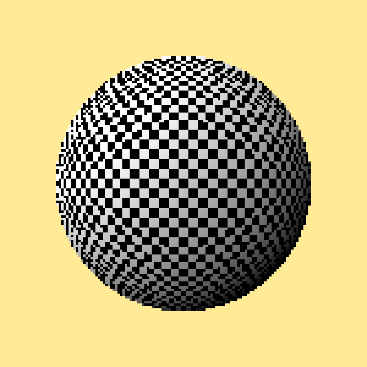
To see how it works, let’s start with everyone’s favorite ray-tracing objects: a checkerboard and a sphere. I’ll use the checkerboard as a surface texture on the sphere. To keep the discussion simple, I’ll focus just on making a picture of this sphere alone in the universe. Here’s the picture I’d like to make: it looks really nice, even as the texture slopes away at the edges. I made this picture using standard ray-tracing with lots of rays per pixel.
In the rest of the discussion I’ll show where our rays strike the sphere’s texture. If we have tons of rays they all pack together and it’s hard to make out what’s going on. So to keep things clear I’ll render the next few spheres at just 30×30 pixels. Out of the 900 camera rays I’ll fire (one for each pixel), about a third will end up hitting the sphere. I’ll draw our tiny rendered spheres with big pixels so they’re easier to see.
The most straightforward way to render this sphere is to send just one ray down the middle of every pixel. If the ray hits the sphere, we sample the color of the texture at that point, which gives us the surface color of the sphere. We then shade that in the usual way and the result is the ray’s color, which becomes that pixel’s color.
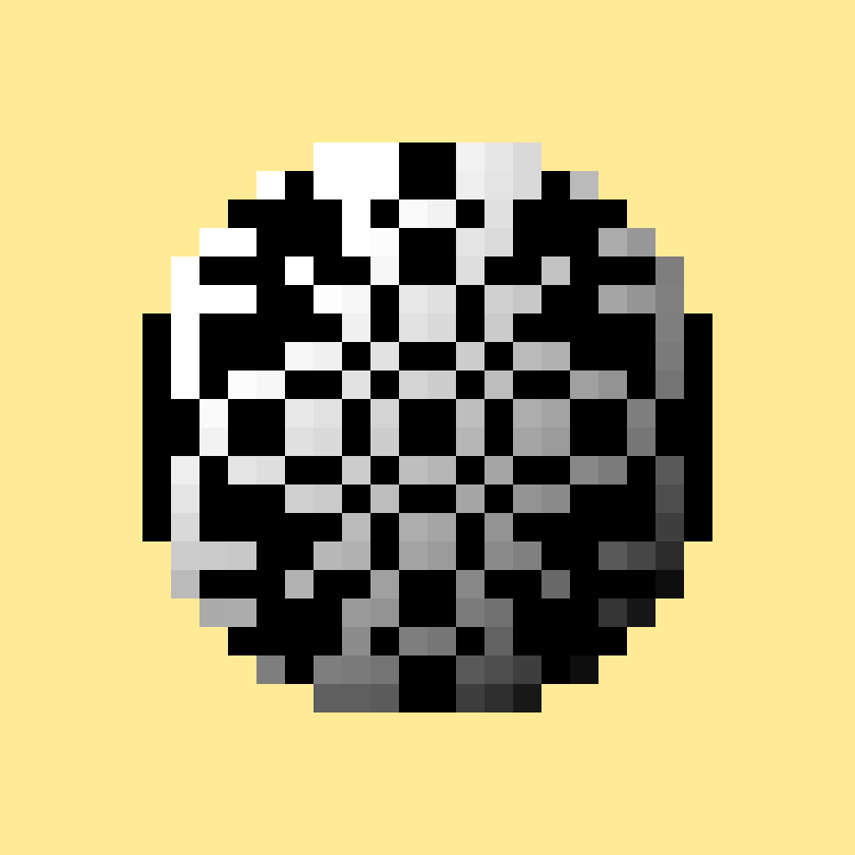 Here’s the result of this operation: a blown-up version of our tiny, 30-by-30 rendered image. As we’d expect, it looks pretty awful. The problem isn’t just that it’s small, it’s that the texture samples are all but random choices of black and white. Let’s see where those samples are landing, and what colors they are.
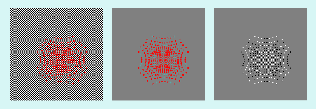 This picture shows the samples in a few different ways. At the far left you can see the checkerboard texture (it’s pretty fine-grained, so if your screen is very small you might not be able to see the individual black and white squares). To show where the samples land, I’ve drawn a bright red ring around each one. The pattern of the samples on the texture is a result of the sphere curving away from us, so samples near the edges are farther apart in texture space than those near the middle.
This image is a little hard to read, so to its right I’m showing just the sample locations without the checkerboard behind them. Each ray carries back only the color that’s in the center of the ring. The picture on the right shows these returned colors, which I’m showing by filling each ring with the color at its center. Remember that these little circles are just to make it easier to see the colors returned by the rays, which are the colors from the checkerboard at the center of each circle. Notice that the black and white colors of the circles have an obvious pattern, because everything from the sphere to the texture to the camera has a lot of symmetry, but the pattern of these colors is nothing like the fine-grained checkerboard they’re being drawn from. This of course is nothing but aliasing in action, and it’s why the rendered picture looks so lousy.
To reduce this problem we can apply some kind of texture anti-aliasing, like map-maps or sum tables. In the case of a sphere, we can probably get pretty good results from mip-maps. But if I had a more complicated shape, and started layering on things like displacement maps, it quickly becomes very hard to choose the right amount of mip-map filtering for every sample. In practice, we use our experience and judgment to come up with some value for the filtering. We just accept that some of the samples will end up aliased, and others will end up blurry, and we hope that things will average out and there won’t be any visible problems.
We can do much better. Given the pictures we’ve just made, we now have a whole lot of information we didn’t have when we started. Specifically, we know not only where every sample strikes the texture, but we know where all the samples are striking the texture. The samples induce a partition, or stratification, of the texture. That is, we can cut the texture up into pieces, one per sample. So rather than give the sample the color of the point it happens to have landed on, we give it the average color of all the texture in the piece associated with that sample.
How should we make these partitions, or strata? Building a Voronoi diagram from the samples is probably a good way to go, but that’s a lot of work to program. A quicker solution is to find each sample’s nearest neighbor, and assign that sample a partition defined by a circle of half that radius. This will surely miss some of the texture that would be in the Voronoi strata, but it’s very fast and we can easily find the average value in the circle. If we’re so motivated, we could make the circles a little larger so that they overlap, and use something like a Gaussian for our filter kernel rather than a right cylinder. Because we can pre-compute the filter coefficients, this gives us a more theoretically correct answer (and one that looks better in practice) for only a tiny bit of additional work. We also need to account for boundaries imposed by visibility, so we don’t accidentally average texture that’s invisible because of occlusion or just because it’s on the back of an object. We can actually use our existing samples to help with that, too, but I won’t go into those details here.
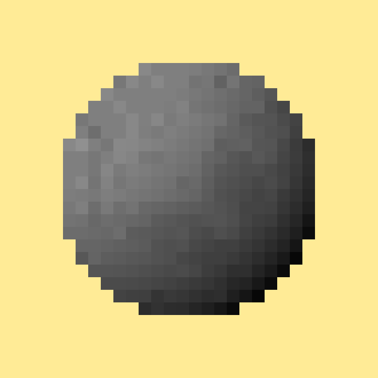 Here’s the improved rendering of the sphere using this technique of dynamic stratification. This picture uses the very same samples that we computed in the previous rendering that looked so bad. To create this improved image, the ray tracer ran in two passes. First I rendered the picture as before, with one sample per pixel. Then I found the radius for each sample’s stratum and the weighted average in that circle. Then I ran the ray tracer again, only now when it asked the texture for the color belonging to a sample, I already have the correctly filtered color for that sample, so I can just return it. In fact, because we’re rendering an identical picture twice, we can save all the information about all the rays, if we have enough memory. Then the second pass isn’t really a rendering pass at all; instead, we’re just replacing the values of sample colors with new colors and then working back up to the color of the camera ray. Compared to re-rendering the picture, this second pass is essentially instantaneous.
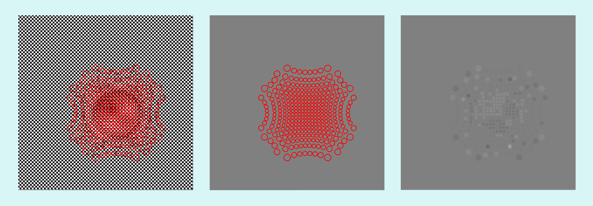 Here’s a visualization of the samples and the regions that they’re averaging. The three pictures follow the same scenario as before, only now the sizes of the rings are meaningful: they show the area that’s averaged to find the color for each sample. As before, the left image shows the samples (and their areas) over the checkerboard, the middle image shows just the samples (and their areas), and the right image shows the resulting colors, again with the size of the circle showing the area that was averaged. All of the circles on the far right are just about medium gray, because they’re all covering a whole bunch of little black and white squares.
You might think that this is a worse result than before, because the samples are essentially all gray, leading to a gray sphere. But that’s really the best we can do. The checkerboard squares are so small that we can’t accurately show them on a sphere that’s in a window only 30 pixels on a side. Both in theory and in practice, this kind of gray sphere is the right answer. If that’s not obvious, think about a real checkerboard sphere that’s far, far away from you. You’d just see a gray blob.


[divider]
To show the results on a larger scale, here on the left is our sphere from the top of the page (rendered at 800×800 and many samples per pixel). In the middle is the sphere at 150×150 rendered with one sample per pixel. And at the right is the same 150×150 sphere, also rendered with only one sample per pixel, but with dynamic stratification. Clearly the improved filtering produces a more accurate image. Note that the big black and white squares in the middle picture are wrong: they’re aliasing artifacts. As the reference image at the left shows, the texture is more finely-grained than you’d guess from that image. Note that the two rightmost images are in reality less than a quarter as large as the leftmost image, but I’ve blown them up so it’s easier to compare all three pictures.
The rightmost sphere isn’t perfect either, of course. Because of my time-saving shortcut of filtering under circles rather than something more accurate (but slower and more complicated) like Voronoi regions, my samples can miss pieces of the texture they should be averaging. But still, what an improvement! You could easily use better filtering regions if you wanted to in your own code, and these artifacts would go away.
I’ve left out all of the math in this discussion, but the math for this algorithm is just lovely. You can replace almost all of the text on this page with just a couple of paragraphs and a few lovely equations. If you wanted to be precise, you could call the fully-featured version of this technique an integral-estimation algorithm using reconstruction of non-uniform samples with a spatially-varying anisotropic filter. Feel free to use that line as an icebreaker at parties and dances.
An important point to remember is that any given texture in a real scene will likely have many different stratifications, induced by many different sampling patterns. The sampling pattern (and the regions that are averaged) don’t actually “belong” to the texture, but to the object that’s firing rays (e.g., the camera, or a point on a surface being shaded). The name dynamic stratification comes from this phenomenon that the stratification changes for every set of rays that’s sampling it.
References
Glassner, Andrew S., “Dynamic Stratification,” Proc. 4th Eurographics Workshop on Rendering, Michael Cohen, Claude Puech, and Francois Sillion, Ed., Paris, June 1993, pp. 5-14
